blog
Custom Graphs to Monitor Your MySQL, MariaDB, MongoDB and PostgreSQL Systems – ClusterControl Tips & Tricks

Graphs are important, as they are your window onto your monitored systems. ClusterControl comes with a predefined set of graphs for you to analyze, these are built on top of the metric sampling done by the controller. Those are designed to give you, at first glance, as much information as possible about the state of your database cluster. You might have your own set of metrics you’d like to monitor though. Therefore ClusterControl allows you to customize the graphs available in the cluster overview section and in the Nodes -> DB Performance tab. Multiple metrics can be overlaid on the same graph.
Cluster Overview tab
Let’s take a look at the cluster overview – it shows the most important information aggregated under different tabs.
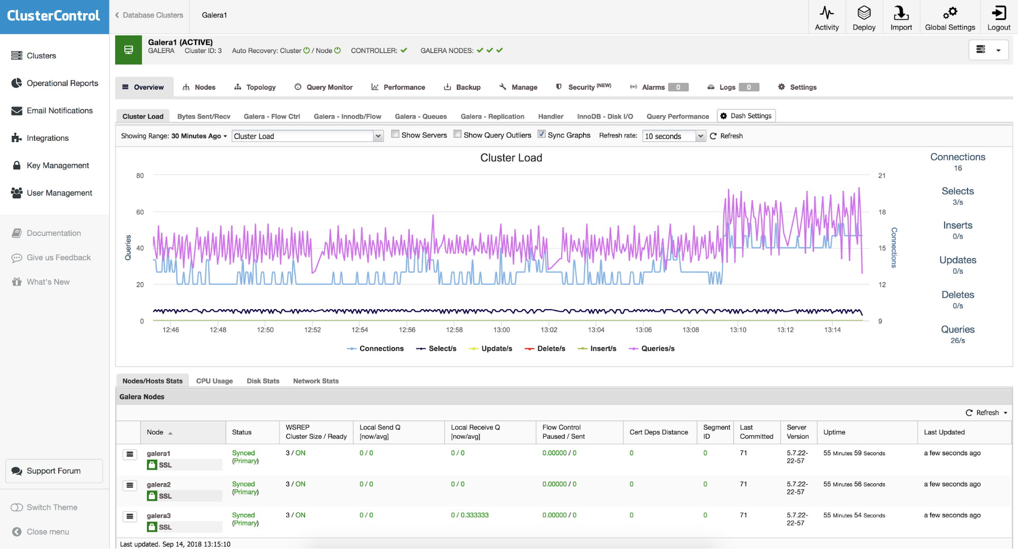
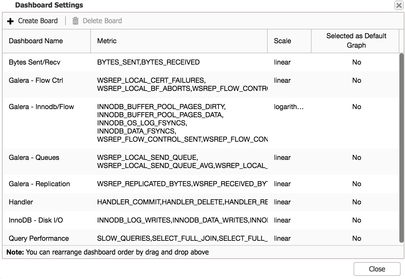
You can see graphs like “Cluster Load” and “Galera – Flow Ctrl” along with couple of others. If this is not enough for you, you can click on “Dash Settings” and then pick “Create Board” option. From there, you can also manage existing graphs – you can edit a graph by double-clicking on it, you can also delete it from the tab list.
When you decide to create a new graph, you’ll be presented with an option to pick metrics that you’d like to monitor. Let’s assume we are interested in monitoring temporary objects – tables, files and tables on disk. We just need to pick all three metrics we want to follow and add them to our new graph.
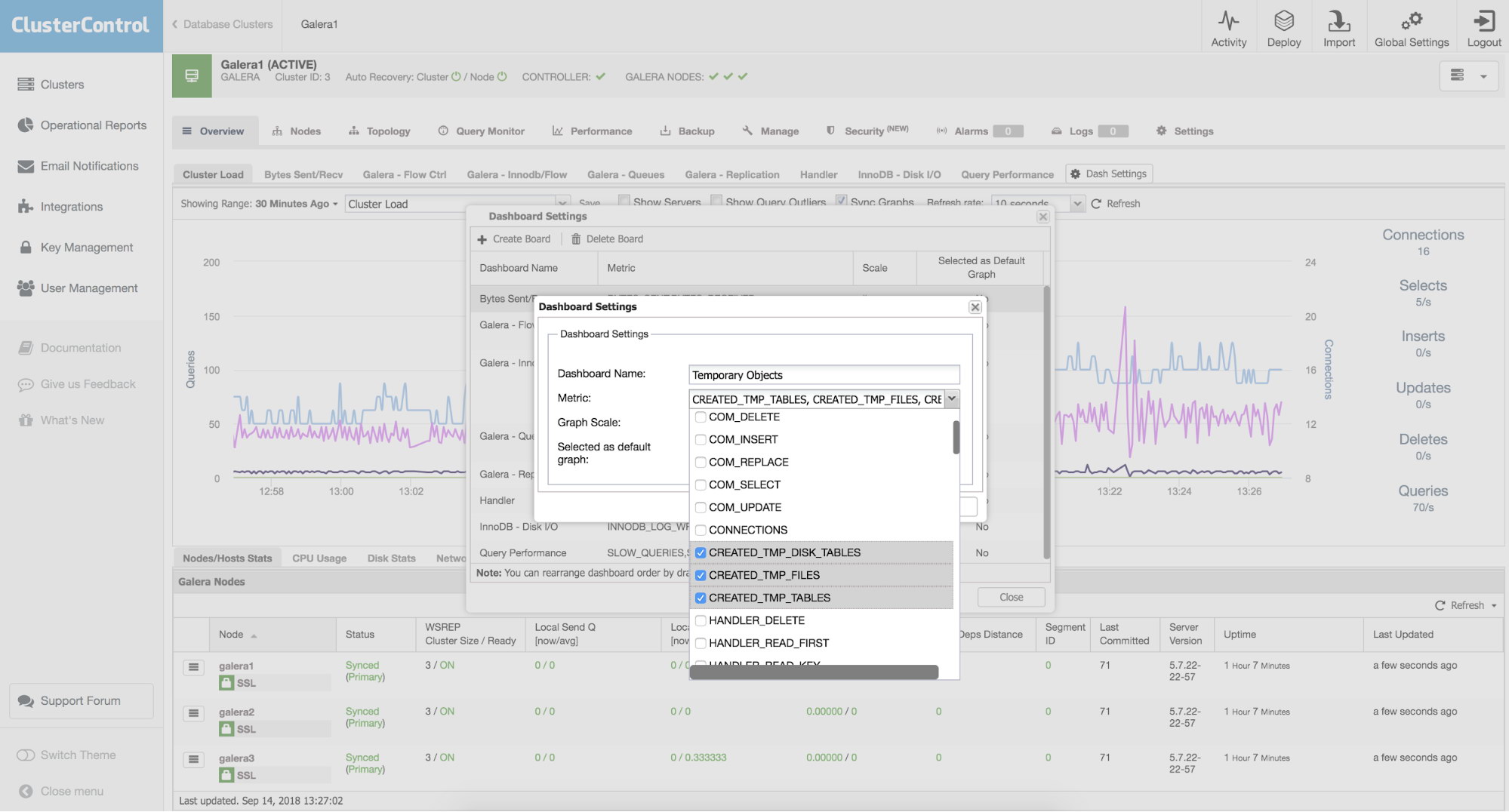
Next, pick some name for our new graph and pick a scale. Most of the time you want scale to be linear but in some rare cases, like when you mix metrics containing large and small values, you may want to use logarithmic scale instead.
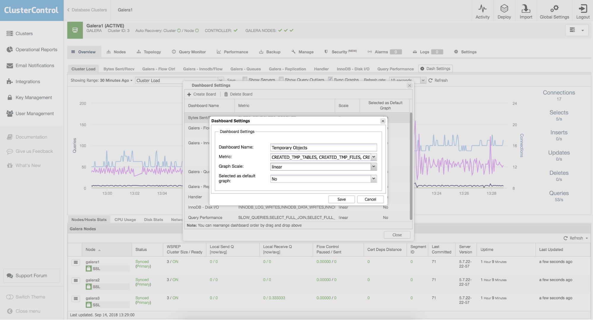
Finally, you can pick if your template should be presented as a default graph. If you tick this option, this is the graph you will see by default when you enter the “Overview” tab.
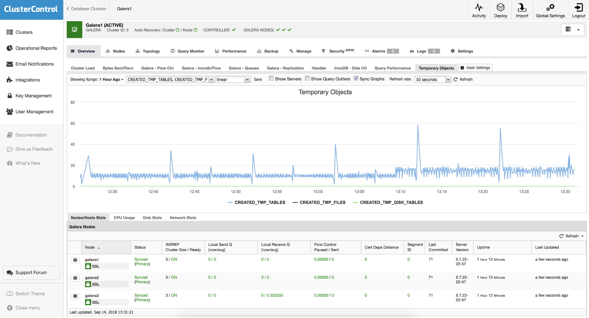
Once we save the new graph, you can enjoy the result:
Node Overview tab
In addition to the graphs on our cluster, we can also use this functionality on each of our nodes independently. On the cluster, if we go to the “Nodes” section and select some of them, we can see an overview of it, with metrics of the operating system:
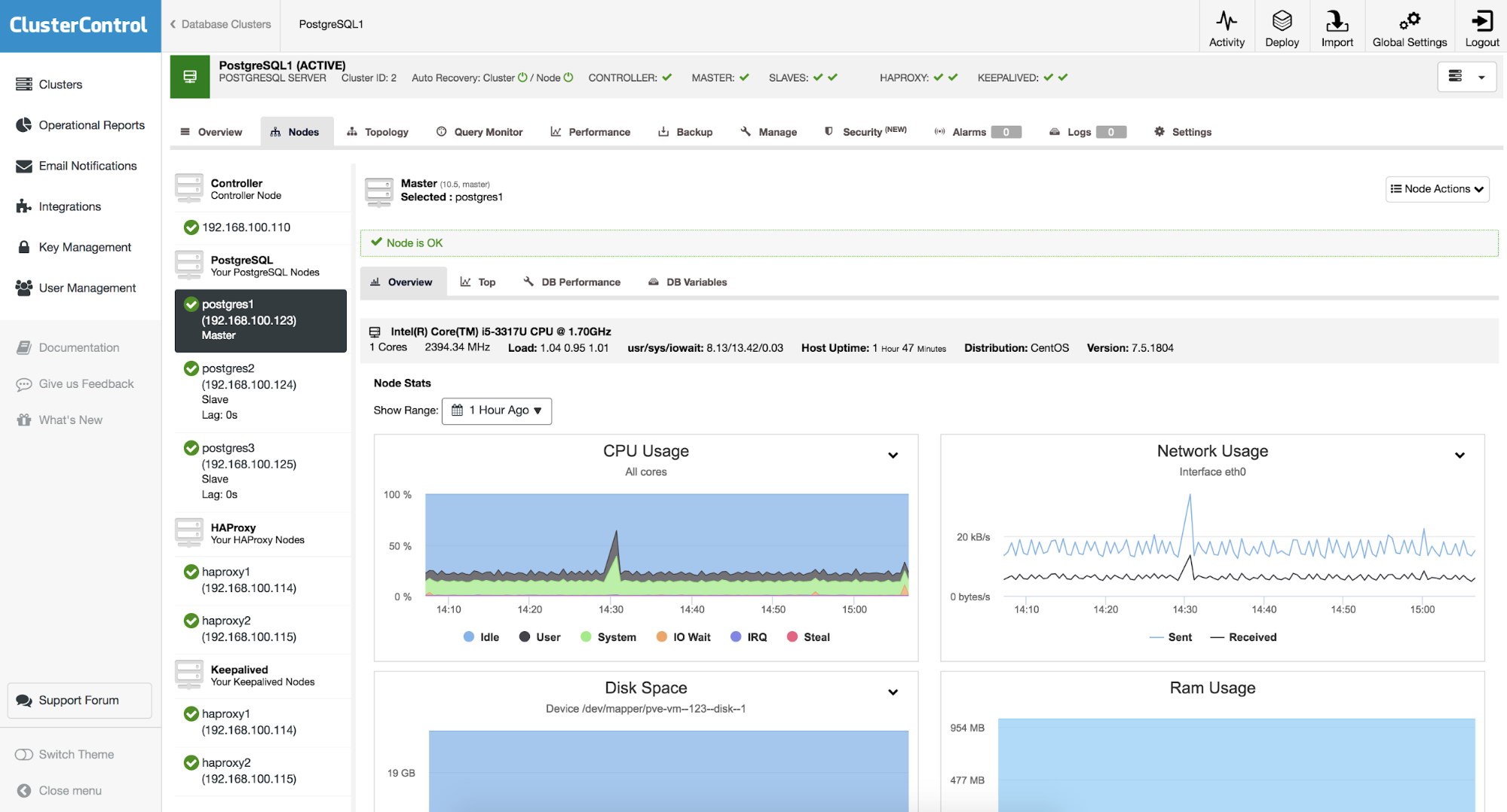
As we can see, we have eight graphs with information about CPU usage, Network usage, Disk space, RAM usage, Disk utilization, Disk IOPS, Swap space and Network errors, which we can use as a starting point for troubleshooting on our nodes.
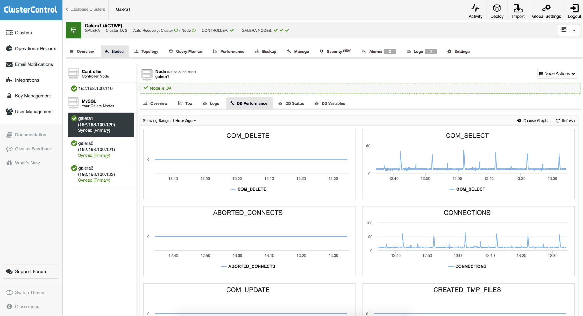
DB Performance tab
When you take a look at the node and then follow into DB Performance tab, you’ll be presented with a default of eight different metrics. You can change them or add new ones. To do that, you need to use “Choose Graph” button:
You’ll be presented with a new window, that allows you to configure the layout and the metrics graphed.
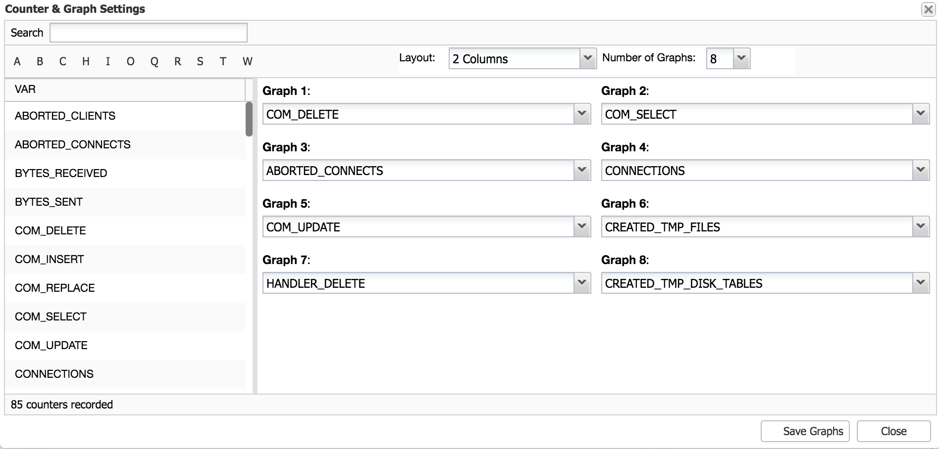
Here you can pick the layout – two or three columns of graphs and number of graphs – up to 20. Then, you may want to modify which metrics you’d want to see plotted – use drop-down dialog boxes to pick whatever metric you’d like to add. Once you are ready, save the graphs and enjoy your new metrics.
We can also use the Operational Reports feature of ClusterControl, where we will obtain the graphs and the report of our cluster and nodes in a HTML report, that can be accessed through the ClusterControl UI, or schedule it to be sent by email periodically.
These graphs help us to have a complete picture of the state and behavior of our databases